- tags
- Design
Type
Coding Fonts
Open Foundry
Typewolf
ドットコロン: Somewhat sci-fi but tasteful
Dharma Type
Huerta Tipográfica
Paratype
TypeTogether
There is very little scientific evidence on readability of serif vs sans type.1
 Adelle: Popular, versatile, magazine-ish (TypeTogether)
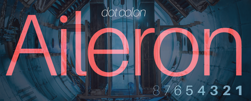 Aileron: Spacey neo-grotesque from ドットコロン. See also the successor, Nacelle. OFL
 Alegreya: Pleasant humanist in sans, serif, and smallcaps. OFL, HT
 Atkinson Hyperlegible: Optimized for low-vision legibility, from the Braille Institute. cf Lexend
 BC Sans: Noto Sans plus glyphs for Indigenous languages used in BC, contributed by FirstVoices
 Bebas: Popular all-caps (Dharma Type)
 Charter: Optimized for low-res laser printers, still very legible on screen. A Butterick favourite among free fonts. cf Charis, a multilingual derivative by SIL with especially good IPA support
 Bitter: Pixel-oriented slab (Sol Matas of HT)
 Bree: Spirited upright italic for display (TypeTogether)
 Calluna: Slopey serif
 Circular: Friendly geometric used by Slack
 Commit Mono: Anonymous mono with “smart kerning” (doesn't work well in Emacs). cf Monaspace
 Crimson Pro: Contemporary OFL Garalde
 Decimal: Inspired by wristwatch lettering
 Fantasque: Programming fonts with some “wibbly-wobbly”
 IM Fell: Literal transfer of an unusual collection of fonts willed to Oxford University
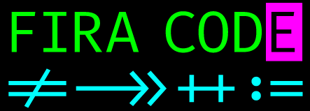 Fira Code: Fira Mono plus cool ligatures. No italics :(
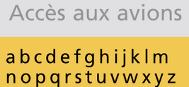 Frutiger: Highly legible sans. Very popular, especially in Europe and for public signage. Spiekermann: “the best general typeface ever”. Many knockoffs, including Apple's Myriad and Microsoft's Segoe.
 Hahmlet: Attention-seeking slab with 한글 support, based on mystery lettering from a poster for a 1940s Korean film production of Hamlet.
 Highway Gothic: Highway sign typeface widely adopted in USA and elsewhere. See Barry Stock's literal transfer to OTF, and Overpass, an open-source derivative (though RedHatOfficial/Overpass#91 caught me, had to use an old version off Font Squirrel)
 Iosevka: Compact and highly customizable monospace/quasi-proportional
 Literata: Custom family by TypeTogether for Google Play Books. Upright italic is hard to get used to
 Lora: Artistic and somewhat calligraphic serif. OFL, very popular
 Los Angeles: Bitmap script by Susan Kare for early MacOS. source
 Monaspace: Mono superfamily with “texture healing”. cf Commit Mono
 Optician Sans: Optometrist test chart letters extended to a complete font
 Playpen: Irregular handwriting (TypeTogether)
 Proforma: Thin, light, spiky. Cordale is similar but squarer and friendlier
 Public Type: Pan-Cyrillic serif+sans+mono courtesy of the Russian Federation (Paratype)
 Quadraat (pictured: DemiBold Italic)
 Sabon: Garalde interestingly constrained to Linotype
 Scala: Early digital humanist (1990), also in sans. Still popular, especially for books. See Joanna for heritage
 Sentinel: Slightly old-timey slab
 Spleen: Mono bitmaps developed for small OLED displays
 Syntax: Humanist sans modelled on Renaissance serif, used in Niklaus Wirth's Oberon OS
 Vollkorn: Workhorse serif with smallcaps (OFL)
anarcat's monospace test sheet
US keyboard coverage:
abcdefghijklmnopqrstuvwxyz`1234567890-=[]\;',./
ABCDEFGHIJKLMNOPQRSTUVWXYZ~!@#$%^&*()_+{}|:"<>?
latin1 coverage: ¡¢£¤¥¦§¨©ª«¬®¯°±²³´µ¶·¸¹º»¼½¾¿
EURO SIGN, TRADE MARK SIGN: €™
ambiguity test:
e¢coC0ODQ iI71lL!|¦
b6G&0B83 [](){}/\.…·•
zs$S52Z% ´`'"‘’“”«»
all characters in a sentence, uppercase:
the quick fox jumps over the lazy dog
THE QUICK FOX JUMPS OVER THE LAZY DOG
same, in french:
voix ambiguë d'un cœur qui, au zéphyr, préfère les jattes de kiwis.
VOIX AMBIGUË D'UN CŒUR QUI, AU ZÉPHYR, PRÉFÈRE LES JATTES DE KIWIS.
Ligatures test:
-<< -< -<- <-- <--- <<- <- -> ->> --> ---> ->- >- >>-
=<< =< =<= <== <=== <<= <= => =>> ==> ===> =>= >= >>=
<-> <--> <---> <----> <=> <==> <===> <====> :: ::: __
<~~ </ </> /> ~~> == != /= ~= <> === !== !=== =/= =!=
<: := *= *+ <* <*> *> <| <|> |> <. <.> .> +* =* =: :>
(* *) /* */ [| |] {| |} ++ +++ \/ /\ |- -| <!-- <!---
Box drawing alignment tests:
█
╔══╦══╗ ┌──┬──┐ ╭──┬──╮ ╭──┬──╮ ┏━━┳━━┓ ┎┒┏┑ ╷ ╻ ┏┯┓ ┌┰┐ ▉ ╱╲╱╲╳╳╳
║┌─╨─┐║ │╔═╧═╗│ │╒═╪═╕│ │╓─╁─╖│ ┃┌─╂─┐┃ ┗╃╄┙ ╶┼╴╺╋╸┠┼┨ ┝╋┥ ▊ ╲╱╲╱╳╳╳
║│╲ ╱│║ │║ ║│ ││ │ ││ │║ ┃ ║│ ┃│ ╿ │┃ ┍╅╆┓ ╵ ╹ ┗┷┛ └┸┘ ▋ ╱╲╱╲╳╳╳
╠╡ ╳ ╞╣ ├╢ ╟┤ ├┼─┼─┼┤ ├╫─╂─╫┤ ┣┿╾┼╼┿┫ ┕┛┖┚ ┌┄┄┐ ╎ ┏┅┅┓ ┋ ▌ ╲╱╲╱╳╳╳
║│╱ ╲│║ │║ ║│ ││ │ ││ │║ ┃ ║│ ┃│ ╽ │┃ ░░▒▒▓▓██ ┊ ┆ ╎ ╏ ┇ ┋ ▍
║└─╥─┘║ │╚═╤═╝│ │╘═╪═╛│ │╙─╀─╜│ ┃└─╂─┘┃ ░░▒▒▓▓██ ┊ ┆ ╎ ╏ ┇ ┋ ▎
╚══╩══╝ └──┴──┘ ╰──┴──╯ ╰──┴──╯ ┗━━┻━━┛ └╌╌┘ ╎ ┗╍╍┛ ┋ ▏▁▂▃▄▅▆▇█
Dashes alignment test:
HYPHEN-MINUS, MINUS SIGN, EN, EM DASH, HORIZONTAL BAR, LOW LINE
--------------------------------------------------
−−−−−−−−−−−−−−−−−−−−−−−−−−−−−−−−−−−−−−−−−−−−−−−−−−
––––––––––––––––––––––––––––––––––––––––––––––––––
——————————————————————————————————————————————————
――――――――――――――――――――――――――――――――――――――――――――――――――
__________________________________________________
Icons
Noun Project: Free icons for lots of things
 SVG animations
Textures
Colors
Just some cool stuff
Graphic Guide to Residential Space Planning
David Rumsey Historical Map Collection
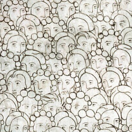 https://twitter.com/WeirdMedieval/status/1738518265402466665/photo/1
Diaolou: Chinese concrete watchtowers
LIFE photo archive hosted by Google
Everest Pipkin: "thinkin about how much wallpaper is in the public domain and how they're already perfectly repeating patterns that can go right into the css background-image property"
Examples: Reproduction Wallpaper | Historic New England, Reproduction Wallpaper | Historic New England, Wallpaper | Historic New England, Wallpaper | Historic New England, Reproduction Wallpaper | Historic New England
Same Energy | Visual Search Engine
Woah.css: CSS animations "for eccentric developers"
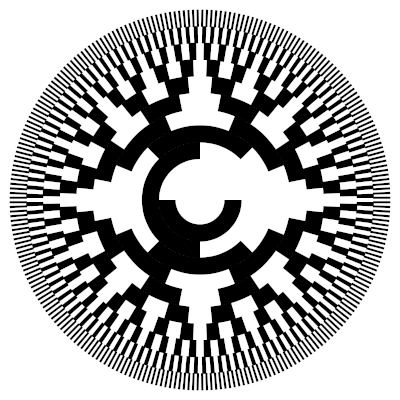 Rotary encoder
Footnotes:
Kas Thomas, “The Serif Readability Myth,” Blogorrhea, January 18, 2013, https://asserttrue.blogspot.com/2013/01/the-serif-readability-myth.html.


